Design Principles - Exercises
DESIGN PRINCIPLES - EXERCISES
__
Jenani Raja Saker (0334331)
Design Principles
Exercises
FINAL PROJECT
For the Final Project, relating to the previous Project, we were to explore sites in KL and as I was already not feeling very well, I decided to use the photos from , previous visit to Brickfields.
I wanted to create a composition regarding a particular flower store that I usually go to but has closed down due to there being too much competition. So, I thought of creating my piece with the idea of advertising this particular store of mine.

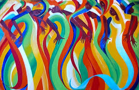
Below are the examples of posters I was going for:
 I wanted my poster to symbolise :
- the colour that is coming out of the picture, leaving the store lifeless (as it is now closed)
Below is my process :


RATIONALE
This poster is meant to be show and tell the story of the flower stalls in Brickfields that are closing. Flowers generally mean a lot in the indian culture as they are a main offering that is offered to the deities so these stalls in Brickfields are quite important. however, this particular street has been closed down due to the competition and this poster tells this story from the colours that are coming out of the image, leaving the store to be lifeless.
PROJECT 2
For this particular project we were required to do a self portrait based on any cultural sites in Kuala Lumpur. While doing this project we were to ask questions to know ourselves better like :
"Who am I?"
"How has culture affected me?"
"How do others see me?"
"How do I see myself?"
The place that I chose to visit was Brickfields, (also known as Little India) as I go there frequently. There are certain elements of myself that could easily identify with the area, the most prominent one being that I am a huge a flower-lover and Brickfields having rows of stalls that make garlands of flowers. So, I know immediately what I wanted to be included into my self portrait .


Hence, I began reflecting bit more on myself and what was going on in my life. I felt as though, a puppet in this huge phenomenon called life, acting and moving along with things that is just happening around. During this period of time, going thorough certain circumstances in life, I also felt like I have changed from before. My previous values, believes, my actions are dead, and I was in the process of being someone new, though I couldn't really figure out what or who. All I know as of now is that I no longer am who I was before.
One word I felt that would best describe this situation happening to me was "Death"
Hence, using certain elements that I found in Brickfields, I choose those that symbolises death and wanted to arrange it to become a
part of me.
Flowers : Garlands are usually adorned with the body of a person who has died in Indian Funeral rituals symbolising that they are now in the realm of God.
Conch : The sound that is played during the death of a person
I began illustrating a mannequin as I felt I was not in control of the situations happening in my life, and want to make it seem that the mannequin was melting away. I choose a soft pink pastel background initially as I am generally known to be a very happy-go-lucky person but not many often knows what is going on in my head which can be often dark. I wanted to portray the irony of the entire symbolism being death with a background that was pinkish. I knew I wanted people to see this as a "beautiful, soft, portrait" but only to discover later that it means "Death".


RATIONALE
My Self Portrait is meant to represent the word "Death". Though looking at it, that would probably be one of the last words in head. This is intended. Often times, people look at me and think of me as a happy and cheerful person without realising what I actually feel is completely different and I am merely just using a mask.
The reason for "Death" being the theme is because, with recent events happening in my life, I feel that the old me, the old values and believes that I had are now dead, and I am in the process of becoming and adopting someone else new though I am not quite there yet.
The meaning of the elements in my self portrait are as below :
Flowers as crown : Garlands are usually adorned with the body of a person who has died in Indian Funeral rituals symbolising that they are now in the realm of God.
Conch : The sound that is played during the death of a person
Wilting Sunflower : The process of my wilting and dying old Self
Manequinn : The feeling of not being control of what occurs around me and the inability to do anything about it.
Background : The Indian motif that is usually used in sarees.
Pink, Pastel, Bright Colours : The irony of life where one perceives meaning merely by judging the outer look.
WEEK 8 (Harmony, Rhythm and Movement)
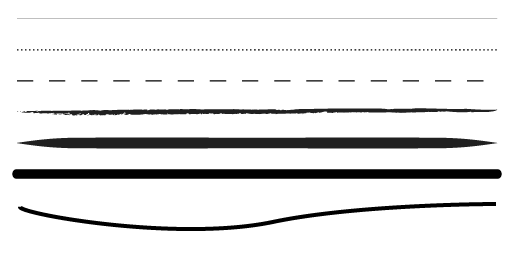
Discussing about the first subtopic which is rhythm, I must admit I got abit confused and couldn't really understand the difference between rhythm and pattern. Wouldn't a repeating rhythm just form a pattern. With a bit of extra research I found a photo explaining the difference.

- Alternating Rhythm
(Alternating rhythm uses 2 or more interchangeable patters or designs that are repeated throughout a piece.)
- Flowing Rhythm
(Flowing rhythm is a rhythm in which movement is shown, most often with organic shapes)
I realised that curved lines are usually used to achieve a flowing rhythm.

- Progressive Rhythm
(Progressive rhythm shows a sequence of motifs/forms through a progression of steps.)


- Random Rhythm
(Random rhythm is when a picture has no pattern what-so-ever.)
- Regular Rhythm
(Regular rhythm is a regular arrangement of parallel lines. it has identical motifs and equal amounts of space between. it has a steady beat, and it can be boring is overdone.)

However, I decided to do a piece on harmony instead after looking at the materials hat I brought.
I wanted to create one dish out of many different dishes from different races to suggest harmony. Although it wasn't harmony in the literal sense of design principle, I wanted this piece to have a deeper meaning of harmony.
__
Jenani Raja Saker (0334331)
Design Principles
Exercises
FINAL PROJECT
For the Final Project, relating to the previous Project, we were to explore sites in KL and as I was already not feeling very well, I decided to use the photos from , previous visit to Brickfields.
I wanted to create a composition regarding a particular flower store that I usually go to but has closed down due to there being too much competition. So, I thought of creating my piece with the idea of advertising this particular store of mine.

Below are the examples of posters I was going for:

- the colour that is coming out of the picture, leaving the store lifeless (as it is now closed)
Below is my process :


During the critique session, Miss Sherry asked me to remove the day and date. Below is the final poster.

This poster is meant to be show and tell the story of the flower stalls in Brickfields that are closing. Flowers generally mean a lot in the indian culture as they are a main offering that is offered to the deities so these stalls in Brickfields are quite important. however, this particular street has been closed down due to the competition and this poster tells this story from the colours that are coming out of the image, leaving the store to be lifeless.
PROJECT 2
For this particular project we were required to do a self portrait based on any cultural sites in Kuala Lumpur. While doing this project we were to ask questions to know ourselves better like :
"Who am I?"
"How has culture affected me?"
"How do others see me?"
"How do I see myself?"
The place that I chose to visit was Brickfields, (also known as Little India) as I go there frequently. There are certain elements of myself that could easily identify with the area, the most prominent one being that I am a huge a flower-lover and Brickfields having rows of stalls that make garlands of flowers. So, I know immediately what I wanted to be included into my self portrait .


I also saw mannequins in many stores to display the sarees that were sold.

Hence, I began reflecting bit more on myself and what was going on in my life. I felt as though, a puppet in this huge phenomenon called life, acting and moving along with things that is just happening around. During this period of time, going thorough certain circumstances in life, I also felt like I have changed from before. My previous values, believes, my actions are dead, and I was in the process of being someone new, though I couldn't really figure out what or who. All I know as of now is that I no longer am who I was before.
One word I felt that would best describe this situation happening to me was "Death"
Hence, using certain elements that I found in Brickfields, I choose those that symbolises death and wanted to arrange it to become a
part of me.
Flowers : Garlands are usually adorned with the body of a person who has died in Indian Funeral rituals symbolising that they are now in the realm of God.
Conch : The sound that is played during the death of a person
I began illustrating a mannequin as I felt I was not in control of the situations happening in my life, and want to make it seem that the mannequin was melting away. I choose a soft pink pastel background initially as I am generally known to be a very happy-go-lucky person but not many often knows what is going on in my head which can be often dark. I wanted to portray the irony of the entire symbolism being death with a background that was pinkish. I knew I wanted people to see this as a "beautiful, soft, portrait" but only to discover later that it means "Death".


RATIONALE
My Self Portrait is meant to represent the word "Death". Though looking at it, that would probably be one of the last words in head. This is intended. Often times, people look at me and think of me as a happy and cheerful person without realising what I actually feel is completely different and I am merely just using a mask.
The reason for "Death" being the theme is because, with recent events happening in my life, I feel that the old me, the old values and believes that I had are now dead, and I am in the process of becoming and adopting someone else new though I am not quite there yet.
The meaning of the elements in my self portrait are as below :
Flowers as crown : Garlands are usually adorned with the body of a person who has died in Indian Funeral rituals symbolising that they are now in the realm of God.
Conch : The sound that is played during the death of a person
Wilting Sunflower : The process of my wilting and dying old Self
Manequinn : The feeling of not being control of what occurs around me and the inability to do anything about it.
Background : The Indian motif that is usually used in sarees.
Pink, Pastel, Bright Colours : The irony of life where one perceives meaning merely by judging the outer look.
WEEK 8 (Harmony, Rhythm and Movement)
Discussing about the first subtopic which is rhythm, I must admit I got abit confused and couldn't really understand the difference between rhythm and pattern. Wouldn't a repeating rhythm just form a pattern. With a bit of extra research I found a photo explaining the difference.

There are also at least 5 different types of rhythm in which clearly draws the line between a pattern and a rhythm.
- Alternating Rhythm
(Alternating rhythm uses 2 or more interchangeable patters or designs that are repeated throughout a piece.)
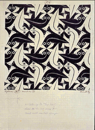 |
| M.C Escher's Lizard (1942) |
- Flowing Rhythm
(Flowing rhythm is a rhythm in which movement is shown, most often with organic shapes)
I realised that curved lines are usually used to achieve a flowing rhythm.

- Progressive Rhythm
(Progressive rhythm shows a sequence of motifs/forms through a progression of steps.)


- Random Rhythm
(Random rhythm is when a picture has no pattern what-so-ever.)
 |
| Pebbles on Ground |
 |
| Random lines |
(Regular rhythm is a regular arrangement of parallel lines. it has identical motifs and equal amounts of space between. it has a steady beat, and it can be boring is overdone.)

However, I decided to do a piece on harmony instead after looking at the materials hat I brought.
 |
| My Magazine which featured food |
 |
| Cutting and pasting components that suggests harmony |
 |
| Cutting and pasting components that suggests harmony |
 |
| Cutting and pasting components that suggests harmony |
 |
| Final Composition |
I also chose dishes that were yellow, red and green as they compliment each other well and form a harmonious colour palette that doesnt clash with one another.

WEEK 5 (Patterns)
I was a bit confused on how to do this exercise, as there was no lecture, and it was rather confusing. I also fell ill this week due to the haze and was unable to attend the class. Below is my work :

WEEK 4 (Asymmetry, Symmetry, Balance)
We had a lecture on Asymmetry, Symmetry, and Balance. I choose to work on Balance, and I may have included elements of asymmetry as well. When I thought of balance the yin and yang symbol came to my mind, but I modified it to moon and sun. Below is my piece:

WEEK 3 (Gestalt)
Gestalt Principle was the second design principle that was taught to us commonly when Gestalt principle is used, we would normally view two objects in a piece.
This was interesting to me as I wanted to pursue into becoming a graphic designer, and some of the best logos actually uses the gestalt principle. For example :

Here we can see the word FED EX, but there is also a small arrow in between the alphabet 'E' and 'X'.
Another example of a famous logo is Baskin Robbins :

We can notice the alphabets 'B' and 'R' and at the same time, the number '31' is highlighted in pink, telling the people of their famous 31 flavours of ice cream.
Below is my exercise for gestalt. I had just seen a poster of the movie IT and chose the character to be one of my subjects, the iconic clown from Stephen King classic 1986 horror novel. While presenting Miss Sherry didn't know IT, and instead saw a lion.. oh well. Here is a reference for Pennywise the clown:
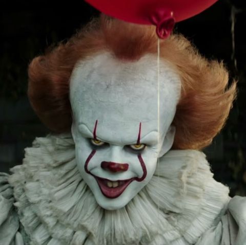
I wanted to include the clown, and the ballon as they are classically associated with this monster of a creature. Below is my completed piece. The trees are supposed to exude the theme of haunted woods, and the face of Pennywise.

WEEK 2 (Contrast)
Below is a summary of what took place during our first class as it wasn't very long (it was the first lesson after all) :
Contrast can exist between :
We were given our first assignment which was to create a piece that showcases the element of contrast. We are to use black paper on white and create a visual piece to showcase the principle of contrast.
I wanted to showcase contrast in three forms:
- texture
- emotion
- colour
Hence, I composed a piece where a bird is flying from a caged hand. The hand that freed the bird is now caged, showcasing the conflict and contrast in emotion.

WEEK 7 (Dots, Lines, Scale, Size)
Dots are essentially a small round mark. Any element with a recognizable center is considered a dot.What do you see? DOTS & CIRCLES |
| In fact, dots are the building blocks of everything else (line, shape, pattern, texture etc). Line is basically many dots combined to from a straight or curved line. |

Below is my attempt at a flower using lines and dots :

WEEK 5 (Patterns)
I was a bit confused on how to do this exercise, as there was no lecture, and it was rather confusing. I also fell ill this week due to the haze and was unable to attend the class. Below is my work :

WEEK 4 (Asymmetry, Symmetry, Balance)
We had a lecture on Asymmetry, Symmetry, and Balance. I choose to work on Balance, and I may have included elements of asymmetry as well. When I thought of balance the yin and yang symbol came to my mind, but I modified it to moon and sun. Below is my piece:

WEEK 3 (Gestalt)
Gestalt Principle was the second design principle that was taught to us commonly when Gestalt principle is used, we would normally view two objects in a piece.
This was interesting to me as I wanted to pursue into becoming a graphic designer, and some of the best logos actually uses the gestalt principle. For example :
Here we can see the word FED EX, but there is also a small arrow in between the alphabet 'E' and 'X'.
Another example of a famous logo is Baskin Robbins :
We can notice the alphabets 'B' and 'R' and at the same time, the number '31' is highlighted in pink, telling the people of their famous 31 flavours of ice cream.
Below is my exercise for gestalt. I had just seen a poster of the movie IT and chose the character to be one of my subjects, the iconic clown from Stephen King classic 1986 horror novel. While presenting Miss Sherry didn't know IT, and instead saw a lion.. oh well. Here is a reference for Pennywise the clown:

WEEK 2 (Contrast)
Below is a summary of what took place during our first class as it wasn't very long (it was the first lesson after all) :
- We were briefed as to how we are to write our blog and what we are to expect during our the course of our module.
- We assigned ourselves group and present a topic. My group and I picked the topic 'Alignment, Hierarchy, Direction, Perspective'.
Contrast can exist between :
- colours
- size
- direction
- textures
- abstract forms such as emotions.
 |
| This image captures the contrast between colours, direction, as well as angles. |
I wanted to showcase contrast in three forms:
- texture
- emotion
- colour
Hence, I composed a piece where a bird is flying from a caged hand. The hand that freed the bird is now caged, showcasing the conflict and contrast in emotion.


Comments
Post a Comment