Typography - Final Project

30/10/2019 - 13/11/2019 (Week 10 - Week 12)
Jenani Raja Saker (0334331)
Typography
Final Project
Lecture 9 : Basic / Describing Letterforms
(Week 10)
We were told to create a placard for the upcoming Troublemakers Manifesto. We ought to create our own slogan in regards to "DESIGN' and the 'SOCIETY'.
Example : ' DESIGN MUST SERVE SOCIETY '
Lecture 10
(Week 11)
It was the final project briefing, in which we had design a digitised version of the statement we used for the placard. Frame the still image and animate it.
Lecture 11
(Week 12)
There was no lecture this week.
INSTRUCTIONS
FINAL PROJECT
For the Final Project, there are 3 parts to it.
1. Create a placard
2. Digitise the slogan
3. Animate it.
PART 1: Designing Placard
Creating a slogan somehow proved to be tough than I expected. I came up with :
GOOD DESIGN SHAPES A GREATER SOCIETY
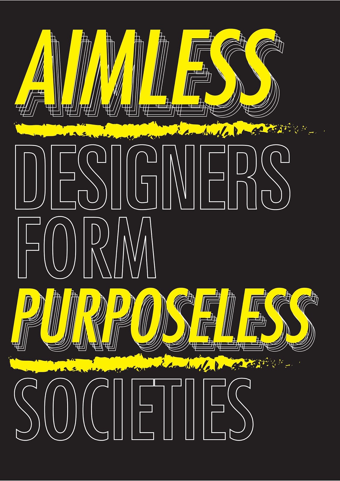
Mr. Vinod commented that the slogan was okay, but it wasn't radical enough. And since it was a protest of sorts I decided to be a bit liberal with the words I'd use. I decided to spend some time thinking about what design means to me, and my beliefs of it. I believe that design should have a purpose and not just simply designing for the fun of it. There needs to be an aim or a gaol for each and every design out there and hence I came up with :
AIMLESS DESIGNERS FORM A USELESS SOCIETY.
and modified it to :
" AIMLESS DESIGNERS FORM A PURPOSELESS SOCIETY. "
I then proceeded to design my layout of the placard. Below are my sketches :
Mr. Vinod approved it and was happy when I said I planned to make the words Red and the background a bright yellow to make sure my placard stands out.
I spray painted my board yellow and painted the words red using water soluble Block Printing Ink. I also spray painted the pipe black.
Below are some of my process photos :
This is my placard, completed :
Mr. Vinod then came to me and said that I would need to outline certain parts of my word to make it more read-able as the strokes were slightly to hard to read.
This is my final placard :
Part 2: Digitising my slogan
Again I seemed to have some trouble with my digitisation as I didn't want it to be too similar with my placard. I wanted it to be different. Hence I came up with a few designs as below:
Option 1 : Purposeless Society is reflected to show that it is a mirror image of Aimless Designers, Form is made into a caution tape to resemble caution to society.
Option 4: Again, playing with the caution tape and highlighting the words Aimless and Purposeless.
Option 6: I wanted the poster to look like a flag, but I don't think I succeeded very well.
Option 7: Design from my placard with a few changes in colour.
Though Mr. Shamsul choose Option 4, with minor changes of tightening the letter spacing, Mr. Vinod went with Option 1 (which was secretly what I wanted as well). He commented that if one were to read the poster, they wouldn't read the word 'form' and he asked me to modify it by making the tape fully a caution tape and inserting the word 'form' into my word layout.
Below is my corrected version :
Mr. Vinod then suggested to make the background textured like a wall, or add some noise and gradient of a greyish tone to it.
I added the texture of a wall and added some noise to the background as well. And below is my Final Poster :
Framed Version :
Below is the pdf file :
This is my Final GIF :
Lecture 11
(Week 12)
There was no lecture this week.
INSTRUCTIONS
FINAL PROJECT
For the Final Project, there are 3 parts to it.
1. Create a placard
2. Digitise the slogan
3. Animate it.
PART 1: Designing Placard
GOOD DESIGN SHAPES A GREATER SOCIETY
Mr. Vinod commented that the slogan was okay, but it wasn't radical enough. And since it was a protest of sorts I decided to be a bit liberal with the words I'd use. I decided to spend some time thinking about what design means to me, and my beliefs of it. I believe that design should have a purpose and not just simply designing for the fun of it. There needs to be an aim or a gaol for each and every design out there and hence I came up with :
AIMLESS DESIGNERS FORM A USELESS SOCIETY.
and modified it to :
" AIMLESS DESIGNERS FORM A PURPOSELESS SOCIETY. "
I then proceeded to design my layout of the placard. Below are my sketches :
Mr. Vinod approved it and was happy when I said I planned to make the words Red and the background a bright yellow to make sure my placard stands out.
I spray painted my board yellow and painted the words red using water soluble Block Printing Ink. I also spray painted the pipe black.
Below are some of my process photos :
 |
| Figure 2.1; Testing out the stroke on a cardboard |
 |
| Figure 2.12 |
 |
| Figure 2.13 |
 |
| Figure 2.14 |
This is my final placard :
 |
| Figure 2.15 |
Again I seemed to have some trouble with my digitisation as I didn't want it to be too similar with my placard. I wanted it to be different. Hence I came up with a few designs as below:
Option 1 : Purposeless Society is reflected to show that it is a mirror image of Aimless Designers, Form is made into a caution tape to resemble caution to society.
 |
| Figure 2.16 ; Option 1 |
 |
| Figure 2.17; Option 2 |
 |
| Figure 2.18 ; Option 3 |
 |
| Figure 2.19 ; Option 4 |
 |
| Figure 2.2; Option 5 |
 |
| Figure 2.21; Option 6 |
 |
| Figure 2.22 ; Option 7 |
Though Mr. Shamsul choose Option 4, with minor changes of tightening the letter spacing, Mr. Vinod went with Option 1 (which was secretly what I wanted as well). He commented that if one were to read the poster, they wouldn't read the word 'form' and he asked me to modify it by making the tape fully a caution tape and inserting the word 'form' into my word layout.
Below is my corrected version :
 |
| Figure 2.24; Chosen Poster ; correction 1 |
I added the texture of a wall and added some noise to the background as well. And below is my Final Poster :
 |
| Figure 2.25 ; Final Poster |
 |
| Figure 2.26; Framed Poster |
Below is the pdf file :
PART 3 : Animating my G.I.F
I didn't want to overcomplicate things and just wanted to animate the caution tape. Below is my process :
 |
| Process of Animating |
 |
| Process of Animating |
 |
| Process of Animating |

FEEDBACK
(Week 10)
Specific Feedback :
1. The kerning between my 'g' and 'n' is not consistent and the stroke of my 'e' is also slightly inconsistent.
2. It looks awkward from far but once we zoom it in, the font looks consistent on the most part.
3. There are elements that need to be worked on but we have to move on.
4. I have to outline "purposeless' a tad bit to make it clearer.
General Feedback:
1. Type out your font name, name and the year in Helvetica 7pt.
2. Try different alignments for our A4 design.
(Week 11)
Specific feedback :
1. Add label to my Project 2.
2. Design my A3 poster according to my placard first before injecting the concept into it. At times, I can be doing both rather than spending/wasting too much time on forming just the concept first.
3. Suggestion to use Baskerville or Bodoni according to my placard design.
General Feedback:
1. View your blog in Incognito Mode to see if your pdf is public.
2. I hear a lot of talking ,I hope theres alot of working, I'm rhyming, I'm rapping.
(Week 12)
I was absent but got my feedback the next week.
Specific Feedback :
1. Change the layout of your words to make it more readable.
2. Add texture to your background.
REFLECTION
Experience :
Final Project was a roller coaster ride for me as it started out great and ended in a not so awesome state. I feel like I could have done way better had I planned out my time better.
Observations :
I observed that I had a fear of being critiqued by my lecturers. I didn't want to face them and was to afraid of their comments which can be very detrimental to my progress and learning process. This is something that I have to overcome.
Findings :
I found out the hard was to take care of my health as it is going to affect my progress not only in this module but in every other module as well. Sometimes I may have overlooked my health and putting my work above me but in the end it is only going to set me back further if I do not take care of my body first.
FURTHER READING
 |
| Figure 5.1 |
Again, I do not want to lie and will admit that I genuinely did not read much at all this entire couple of weeks. However, I did come across this book on Torrent (which I did not complete) and below is the rough summary of it :
Just My Type is a book of stories about fonts. It examines how Helvetica and Comic Sans took over the world. It explains why we are still influenced by type choices made more than 500 years ago, and why the T in the Beatles logo is longer than the other letters. It profiles the great originators of type, from Baskerville to Zapf, as well as people like Neville Brody who threw out the rulebook. The book is about that pivotal moment when fonts left the world of Letraset and were loaded onto computers, and typefaces became something we realized we all have an opinion about. And beyond all this, the book reveals what may be the very best and worst fonts in the world – and what your choice of font says about you.


Comments
Post a Comment