Advanced Typography - Project 1
Jenani Raja Saker 0334331
Advanced Typography
Project 1
LECTURE
Week 5 (12.05.20)
INSTRUCTION
Project 1
FEEDBACK
Week 6 Specific Feedback : 1. I did good, the artwork was approved. 2. Just gotta sligthly tweak the 'AND' to follow the shape. 3. I can move on to the next project! (yay!) General Feedback: 1. It's best to begin with sketches as there is where you can make quick changes to the key artwork and experiment around with it. 2. Begin with the basic colors of black and white, use that as a parameter to figure out whether the layout works or not. If it looks bad in black and white, it most probably would look bad in color as well. 3. Do research.. Research, research, research. Make sure the research and references that we use is good and up to the standard. 4. See the examples posted in Facebook, a key artwork is "similar" (not on similar, it does not mean exactly) to a logo. It is a stand alone artwork. Elements from the key artwork can be adapated into thecollaterals later on. 5. Again, this is a typography class so the key artwork has to be based off type. The hero has to be the type and not the illustration. Those would only behave as non-objective elements, complimenting the type. So best to work on the type and its placement, and go from there. 6. Produce more than just one work or idea. In the industry it is expected to show up to 10 different takes on the project. 1-2 a week just is not going to cut it. 7. We ought ot be more mindful of the spaces surrounding the artwork. It has to be one unit, more or less like a logo of sorts. Week 7 Specific Feedback: No Class General Feedback: No Class Week 8 Specific Feedback: 1. Even if you get a positive feedback, use the remaining time to see if it can be developed further. Take a look at your design, with the knowledge of what you have seen today, how can you stay above with your work, what could you do to make it look even better. Now it may be that what you come up with may not necessarily be better but you never until you try. 2. The new designs look better, it is up to you which one you want to choose. General Feedback: 1. Only minor variations should be introduced for our Project 2: Collaterals. 2. Breaking down the information into bits for the microsite is not advisable. 3. Look into the variations, and how it has changed from the original key artwork to different variations. 4. The poster sets the tone of the key artwork and should be in A2. The larger the poster, the more impactful it is. A2 = 16pt. 5. Remember that it's an event, hence anything related to an event can be considered as your collateral. 6. Analyze good layout design. What is the text aligning to? Where's the balance of it?
REFLECTION
Experience
This as a rather confusing assignment as it was something new for me, doing a Key Artwork. I didn't quite get what it meant. And when it was explained that its a form of logo, I found it even harder to make it work, more so as the title was long. I think I need to view and analyse more artworks to have more ideas and creativity in designing a key artwork.
Observation
I observed and learnt that, when referencing or using other designers' works, one has the tendency to probably take too much which may blur the lines between plagiarism as well as just 'deriving inspiration'.
Findings
It was my groups presentation this week and we were presenting on the topic of Designing Type (which is something we will be doing for the Final Project). The essence of the presentation is basically, the Anatomy of Type (to identify the necessary requirements and parts of letterforms), General Process of Designing Type as well as some examples of designers process in designing letterforms.
Below are the google slides:
INSTRUCTION
Project 1
For the first project, we were intended to creatively and conceptually use visual and type in combination to create a key artwork to be used in the collateral design for example T-shirt, sticker, Badge and so on. The focus here is to use visual elements, and or graphical elements and the title (type) in an experimentive, impactful and visually attractive manner. The use of imagery must be of similar importance with the title in terms of visual hierarchy. The information reflected was the crucial point instead of what it looked like.
The three topics that we had to choose from were:
1. The ABC's of Bauhaus Design Theory
2. All Ripped Up: Punk Influences in Design
3. Russian Constructivism and Graphic Design
I decided to go with the 3rd title because I had attempted something along the lines of Bauhaus in my previous module of Typography and also because its quite common. Russian Constructivism was something new to me, and also didn't seem as challenging as Punk Influences.
Hence I decided to look up more about Russian Constructivism. Out of my research, one of it which caught my eye and contributed a lot to my notes of the background of Russian Constructivism is the video from the Futur which was primarily featuring the works of Vladimir Rodchenko, but also explained the essence/summary of what Russian Constructivism is all about.
I then decided to make some drafts:
 |
| Figure 2.01; Draft of Key Artwork#1 |
 |
| Figure 2.02; Draft of Key Artwork #2 |
 |
| Figure 2.03; Draft of Key Artwork #3 |
 |
| Figure 2.04; Draft of Key Artwork #4 |
 |
| Figure 2.05; Draft of Key Artwork #5 |
I did not show the lecturers the first 4 options for a couple of reasons:
1. They did not feature the title.
2. Usage of image.
3. Poster-like
Hence I choose to show the 4th draft and to my luck the lecturers liked it. However, in the upcoming weeks, a few others with a similar layout even to the choice of typeface. After consultation with Mr. Vinod, I decided to try and improve on the current key artwork.
 |
| Figure 2.06; Draft of Key Artwork #1 (Round 2) |
 |
| Figure 2.07; Draft of Key Artwork #1(vacation color) (Round 2) |
 |
| Figure 2.08; Draft of Key Artwork #2 (Round 2) |
Mr. Vinod leaned more towards Figure 2.08, though he did leave it to me in the end. Upon, doing some experimenting with how I would place the information of the poster I decided to go with Figure 2.06 & 2.07 (as a colour variation). I wanted to provide options for the poster through variation.
It is through the process of creating my poster (Project 2), that I had several changes to the Key Artwork, realising that the grid inside served no purpose and was inhibiting the view of the information that is to be placed within.
Hence I made the decision to remove them. Below is the result after the changes.
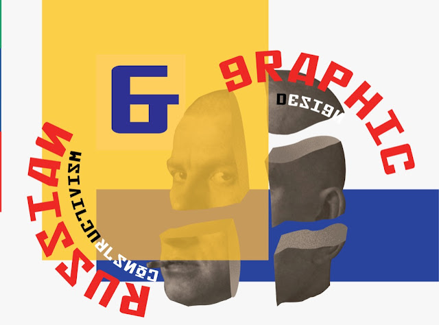
Final Key Artwork (JPEG & PDF)
FEEDBACK
Week 6 Specific Feedback : 1. I did good, the artwork was approved. 2. Just gotta sligthly tweak the 'AND' to follow the shape. 3. I can move on to the next project! (yay!) General Feedback: 1. It's best to begin with sketches as there is where you can make quick changes to the key artwork and experiment around with it. 2. Begin with the basic colors of black and white, use that as a parameter to figure out whether the layout works or not. If it looks bad in black and white, it most probably would look bad in color as well. 3. Do research.. Research, research, research. Make sure the research and references that we use is good and up to the standard. 4. See the examples posted in Facebook, a key artwork is "similar" (not on similar, it does not mean exactly) to a logo. It is a stand alone artwork. Elements from the key artwork can be adapated into thecollaterals later on. 5. Again, this is a typography class so the key artwork has to be based off type. The hero has to be the type and not the illustration. Those would only behave as non-objective elements, complimenting the type. So best to work on the type and its placement, and go from there. 6. Produce more than just one work or idea. In the industry it is expected to show up to 10 different takes on the project. 1-2 a week just is not going to cut it. 7. We ought ot be more mindful of the spaces surrounding the artwork. It has to be one unit, more or less like a logo of sorts. Week 7 Specific Feedback: No Class General Feedback: No Class Week 8 Specific Feedback: 1. Even if you get a positive feedback, use the remaining time to see if it can be developed further. Take a look at your design, with the knowledge of what you have seen today, how can you stay above with your work, what could you do to make it look even better. Now it may be that what you come up with may not necessarily be better but you never until you try. 2. The new designs look better, it is up to you which one you want to choose. General Feedback: 1. Only minor variations should be introduced for our Project 2: Collaterals. 2. Breaking down the information into bits for the microsite is not advisable. 3. Look into the variations, and how it has changed from the original key artwork to different variations. 4. The poster sets the tone of the key artwork and should be in A2. The larger the poster, the more impactful it is. A2 = 16pt. 5. Remember that it's an event, hence anything related to an event can be considered as your collateral. 6. Analyze good layout design. What is the text aligning to? Where's the balance of it?
REFLECTION
Experience
This as a rather confusing assignment as it was something new for me, doing a Key Artwork. I didn't quite get what it meant. And when it was explained that its a form of logo, I found it even harder to make it work, more so as the title was long. I think I need to view and analyse more artworks to have more ideas and creativity in designing a key artwork.
Observation
I observed and learnt that, when referencing or using other designers' works, one has the tendency to probably take too much which may blur the lines between plagiarism as well as just 'deriving inspiration'.
Findings
I found that, in pursuit for perfection, one should always strive and not get too comfortable with where they are at. The instance one thinks they have done their best in art, it is probably that instance that all possibility for the art evolving dies. Constantly working on it, even when you feel you have nothing else to explore is a good exercise in pushing the boundaries of creativity and limitations one has.
FURTHER READING
FURTHER READING


Comments
Post a Comment