There are no lectures from Week 6 forth as we lack time and are required to focus on our project work.
INSTRUCTION
Project 2 - Collaterals
Students are tasked to design a poster and two other collateral items of their choosing, using the key artwork developed in the task before this. Examples of key collaterals include t-shirt, tote bag, pin badges, etc. Students will work on the poster first and fine tune the outcomes before going on to complete the other collateral material.
The content for the poster is similar to that of the Typographic Systems Exercises.
The process of achieving my results are as follow:
1. Exploration of Poster Variation
2. Exploration of Collaterals
Posters
Beginning the attempt of designing my poster, I had a major decision to make first. I had two key collaterals in which I can choose from to proceed with my poster. So I decided to try and explore my options with both and see which was easier for me to work with. I also played with colour variations to see what would come out best.
 |
| Figure 2.01 |
 |
| Figure 2.02 |
With the feedback Mr. Vinod gave I got the message that Mr. Vinod wanted us to incorporate the information with the key artwork. They should interact and interplay well - as what we practiced with the exercises- with the key artwork.
I found it hard to achieve the interplay with the second key artwork though it was preferred by the lecturers thus decided to go with the former.
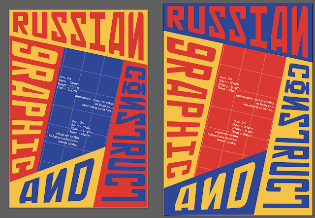
Below are my second attempt at the poster. the typeface featured in my key artwork is Soviet X-panded Bold. I decided to pair that with Gotham as I felt that Gotham has a relatively 'squarish' formation that would go well with the former type.
 |
| Figure 2.03 |
 |
| Figure 2.04 |
 |
| Figure 2.05 |
Mr. Vinod liked the arrangement of Figure 2.05 best though liked the colors of red and yellow of the previous variations. He suggested to incorporate the circular elements of text of previous trials into the chosen one as the text in the middle seems to be isolated.
Upon analysing again, I realised that was very much true. The information was sort of floating in the middle with no interaction with the rest of the artwork. I also realised that the grid like set up at the back honestly served no purpose exactly and was very distracting . I decided to eliminate that in my next attempts. Below are my third revisions.
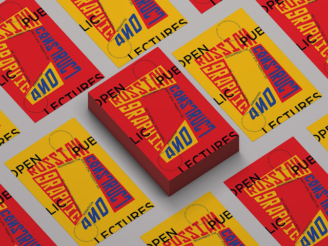
The final one was Figure 2.12. I decided to utilise both color variations as I had observed certain events that had 2-3 variation of posters which in my opinion created some visual variety. The examples are below :
 |
| Figure 2.15 |
 |
| Figure 2.16 |
 |
| Figure 2.17; Super stunning poster layout |
The idea was approved by Mr. Vinod. Below is the pdf and JPEG of my final Poster:
 |
| Figure 2.18; Final Poster 1 |
 |
| Figure 2.19; Final Poster 2 |
E - Invite
Below are some process shots of me animating the e-invite. My intention was to have very angular movement as based on my research , Russian Constructivism features dynamism and movement. But I was starting to fall terribly ill around this period and (not a valid reason) but came up with a sub-par e-invite that probably requires more refinement. This is NOT the final e-invite.
Collaterals
I began experimenting with my collaterals way before I finalised my poster just to get a feel of how and what I want to be included. Below are some of the explorations using key artworks of my previous attempts :
1. My poster was not finalised.
2. The color choice for my backgrounds seem kind of immature and the choice of my bag seems very 'auntie-like'.
I decided to look at more examples from professional branding agencies and the way they display their work.
I also wanted to divert from the same collaterals such as t-shirts and badges and decided to find out items that would be relevant to an event or conference/public lecture etc.
I decided to do : website, binder folders (for event staff), tote bag (couldn't run away from this), posters, public lecture slide, event book, lecture seat tickets.
Below are the explorations :
 |
| Figure 2.33 |
 |
| Figure 2.34 |
 |
| Figure 2.35 |
 |
| Figure 2.36 |
 |
| Figure 2.37 |
 |
| Figure 2.38 |
 |
| Figure 2.39 |
 |
| Figure 2.40 |
 |
| Figure 2.41 |
 |
| Figure 2.42 |
Mr. Vinod noted some problems with the mockups, such as the background lighting, and certain choices. Therefore I decided to swap out and change the way I presented some of my items.
FINAL COLLATERALS :
 |
Figure 2.43; Final Poster Mockup
Figure 2.44; Final Tickets Mockup
Figure 2.43; Final Poster Closeup (Style Shot)
Figure 2.44; Book on Russian Constructivism
Figure 2.45; Public Lecture
Figure 2.43; Final Web Page
Figure 2.43; Final Totebag
Figure 2.43; Final Binders
|
Figure 2.43; Final Compilation of Collaterals
Final Flat Lay of Collaterals (JPEG)
FEEDBACK
Week 8
Specific Feedback:
1. Even if you get a positive feedback, use the remaining time to see if it can be developed further. Take a look at your design, with the knowledge of what you have seen today, how can you stay above with your work, what could you do to make it look even better. Nnow it may be that what you come up with may not necessarily be better but you never until you try.
2. The new designs look better, it is up to you which one you want to choose.
General Feedback:
Week 9
Specific Feedback:
1. I still feel the treatment of the text in there isn't solved. Maybe you can adapt the circular rendering like you did in the previous posters above or something with a little more presence.
2. BTW, I do like the color scheme of these two. One or the other would be good.
3. Good work. Some of that variaton you created could be helpful in the invite. I think you can move quickly now to complete.
General Feedback:
Week 10
Specific Feedback:
1. The animation couldve been better. I need to make it punchier and more exciting. Direct to the point.
2. The circle should be bigger as the viewer can't view the information properly.
3. Needs improvement.
General Feedback:
1. We have very limited time available for us and we've to try our best to complete it within the limited time frame given to us.
2. The animation for the scoial media invite needs to have elements in the art work and some sort of interactivity.
3. The final project was debriefed and we're to solve a problem using typography. It has to be related to our specialisation and also our interest.
Week 11
Specific Feedback:
1. The paper texture too crumpled. Wall too dark.
2. The simulation wall should be more like this (referring to other option)
3. This simulation is more appropriate for business cards and not posters. Don't use it.
4. Looks nice. What is it?
5. The file for an event .... not practical no?
6. But the design overall and application is excellent. It's looking pretty professional. Just I think you can choose the ones that work the best from the above. Maintain a consistency in the background (for simulation.)
7. (Provided some examples) Example of simulation... simple. Well lit applications.
8. You should print these posters-when possible I'd love to put them up in the class (whenever we return)
REFLECTION
Experience
Once again, a roller coaster ride for me. My illness finally caught up to me, and I was unable to deliver to my own expectations. However, I definitely tried my level best to keep up with the pace of the class.I am not going to lie, It was tough, and still is tough as I am typing this. It all boils down to stress and time management. I shouldn't let them get the best of me. Lots of lesson learnt here.
Observation
I began to notice a certain amount of pressure or fear of disappointing my lecturers. And given that I was rather ill, it began to have a detrimental effect to my overall health. I was afraid of failing. I think I still am and I feel that it something I definitely need to cross. I have to accept that failure is very normal and it is unfair to expect perfectionism from myself all the time. Failure is a part of the growth process especially in the field that I am in.
Findings
My primary resource for finding inspiration has most often been Pinterest. But I discovered a better tool. Instagram! I had previously not bothered about Instagram as I found it difficult to find the exact type of inspiration that I was looking for considering the fact that it wasn't exactly an information based social media as opposed to google or Pinterest.
But with the use of hashtags, I was able to fine-tune and narrow down my search and honestly found much more professional examples from experts in the industry. That is the standard that I should aspire for.
FURTHER READING
In my attempt of being honest, I truly did not read up any books, but my research of trying to figure out how best layout works I did read up several articles and watch several videos from one of my online "heroes' Chris Do and his team at the Futur.
They have super awesome content and lots of valuable tips on layout design and rules.


Comments
Post a Comment