Publishing Design - Exercises

28.08.2020 - 1.10.2020 (Week 1 - Week 6)
Jenani (0334331)
Publishing Design
Exercises
Jenani (0334331)
Publishing Design
Exercises
LECTURES
As the lectures were already pre-recorded, we had to listen and go through them in our own time and convenience and apply the knowledge into our tasks.
INSTRUCTIONS
EXERCISES
EXERCISE 1 : Mockup-making & Content Generating
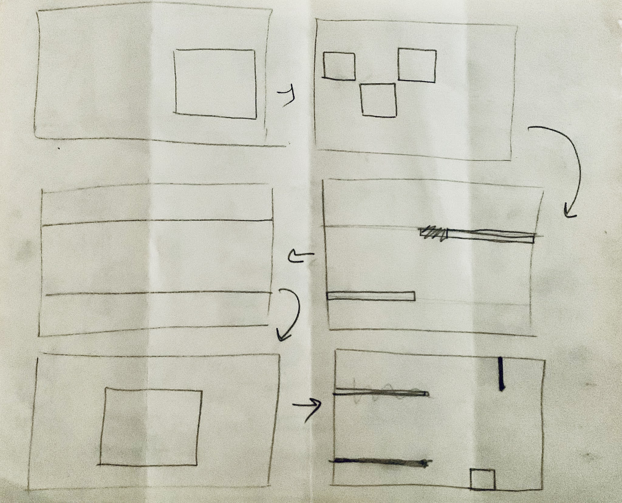
For this exercise, Mr Vinod demonstrated through Facebook live. We were asked to prepare A4 (16 sheets) / A3 (8 sheets) paper, large rubber band / thread with needle, adhesive tape (masking, sellotape, scotch), steel ruler (16" if you have), cutter and pencil.
For the exercise we were told to fold the A3 paper in half and come up with 3 different sizes that are smaller than A4 and bigger than A5. I began to explore the possible sizes (the size chosen is highlighted below).
- 170x270mm
- 250.5x200mm
- 190x240mm


EXERCISE 2 : Signature Folding System


EXERCISE 3 : Van de Graaf
Traditionally done through physical paper, Mr. Vinod asked us to skip one step and do the Van De Graaf lines directly in InDesign.
EXERCISE 4 : Text Formatting
EXERCISE 5 : Layout Dissection
The best way for us to learn layouts and grid systems would be to figure out and dissect what the layouts/grid systems are in our favourite books or magazines. Much like when dissecting letterforms, we get to see what goes into constructing them, when dissecting layouts, we get to view how the designer thinks, observe the creativity and try and mimic their success.
Below are some of the layout dissections that I performed on the layout systems that I liked and wanted to emulate for my book personally :
Exercise 6 : Determining Grids
Very much alike to the exercise above, determining grids asks us to look at visual examples of other grids such as the margins and columns of layout, and try to determine what the appropriate grid would look like for our book. So, basically once we have dissected the layouts that we like, we try and apply those elements in the form of margins, columns, header texts, etc. Mr. Vinod would then give comments about our work, helping us ahead for our Project 2.
Below are the 3 grids I have created inn the Determining Grids Exercise.
 |
| Figure 2. 6 ; Determining Grids 1 |
 |
| Figure 2. 6 ; Determining Grids 2 |
 |
| Figure 2. 6 ; Determining Grids 3 |
Exercise 7 : Form & Movement
The Form & Movemenet Exercise acts as a stepping stone, allowing us to plan the 3 elements, textual, imagery and shape ahead for our book. As opposed to having a layout that does not serve a purpose, this exercise is to teach us how to create movement through the forms of the three elements. The shapes despite being static should indicate some sort of progression giving the illusion of movement through out the spreads. We were required to create 8 spreads of this continuous movement. This exercise was split into 4 Phases.
Phase 1
In this phase, we are to use only Black and White Colors and create movements through shapes. I began by sketching it out, as it was thought for me to visualise it through the spread arrangements in Indesign. This proved to be a smart step as I was able to breeze through this exercise easily, as I was able to create the movement in this manner.
 |
| Figure 2. 7 ; Sketches of Form & Movement 1 |
 |
| Figure 2. 8 ; Sketches of Form & Movement 2 |
 |
| Figure 2. 9 ; B&W Form & Movement Phase 1 |
 |
| Figure 2. 10 ; B&W Form & Movement Phase 1 gif. |
Phase 2 (Color)
Phase 2 is to add color to the forms and see how we can balance it with a 70% to 30% ratio with the latter being coloured.
 |
| Figure 2. 11 ; Final Color Form & Movement Phase 2 |
 |
| Figure 2. 12 ; Color Form & Movement Phase 2 |
Phase 3 (Image)
Phase 3 is to add Imagery to either of the coloured or non coloured forms. We should be smart and creative to manipulate the image and create visual excitement by choosing to reveal the image in a tasteful manner as opposed to using the entire image wholly in every spread.
Below is my attempt:
 |
| Figure 2. 13 ; Final Image Form & Movement Phase 3 |
Phase 4 (Text)
Phase 4 is to add textual element to the layout. We should follow the set margins and choose how and where we want to place the body of our text. Here is my attempt and the final gif:
 |
| Figure 2. 13 ; Final Image Form & Movement Phase 4 |
 |
| Figure 2. 14 ; Final gif. Form & Movement Phase 4 |
FEEDBACK
Week 1
Specific Feedback :
1. The Van de Graaf exercise looks good, no changes.
2. Can proceed to finish up the mock up making of the book.
General Feedback :
1. Blogs and feedback sheet should be updated as soon as possible.
2. Complete 3000 word content by next week so that we will have enough time to complete the visuals.
Week 2
Specific Feedback
1. The paper for the mockup of the book should be lesser than 100gsm, just enough for it to bend easily and not have too thick of a diameter.
2. Its alright to make these mistakes, we'd be more aware on where we'd have to keep an eye in the future.
General Feedback
1. Always update your eportfolio and the feedback sheet weekly.
Week 3
Specific Feedback
1. -
General Feedback
1. The margins constitutes a large portion of the look and feel of the book. Good margins can make the visual appearance of the book feel grand. The text must fill in the margins.
2. Complete our Determining Grids Exercise and post it in our blogs.
3. Watch the Form & Movement Exercise on the FB lecture.
Week 4
Absent
Week 5
Specific Feedback
1. Form & Movement Phase 1 Exercise is good. The continuity is there. There was a small change to be made to provide a bit more of an exciting transition.
2. Form & Movement Phase 2 Exercise, was fine as well. I could perhaps increase the usage of yellow, but it is fine as it is.
General Feedback
1. The ratio for Color to Form is usually a 70%-30%.
2. The purpose of the exercise is so that we can see how the placement of the visuals and text transition and forms sort of a movement.
Week 6
General Feedback
1. E-Portfolio for the Exercises should be complete by the next class.
Specific Feedback
1. I'm good to go on both 3rd and 4th Phases of Form & Movement Exercises.
2. I should stick to my margins for the 4th Phase of Form & Movement.
3. I'm done with my F&M exercises, signed, sealed, delivered!
REFLECTION
Experience
The whole experience of this exercise was abit tough in the beginning as I found it not quite exciting - until we did Form & Movement - as most of my attention was taken up by Project 1. I didn't find myself thinking or analysing the exercises we were doing as much as I would in the previous modules that Mr. Vinod taught.
I thoroughly enjoyed the Form & Movement Exercise. I wouldn't mind doing another one should there be more time. It was super interesting and allowed me to stretch my creative muscles a little bit, and it was a very pleasant challenge. I don't know how to put it. Almost like solving a crossword puzzle or like Sudoku. It was super fun, trying to figure out how to create movement beginning with the very first form in the very first spread.
Observation
I observed that each and every part of the exercise is curated and designed specifically in a way that chips in to the progression of our Project 2, the book layout. By, completing the exercises, I sort of know what to expect or what I should do for Project 2, though in all truthfulness I am still a little intimidated by InDesign, as I do not have much experience or spend much time on it. It could be holding me back from being a little more experimentative with my designs.
Findings
I am not quite sure what, but I found myself having a very different attitude and approach to modules this semester. While I am stressing less about the modules, I also kind of care lesser, about the outcome. I think I am no longer afraid of failure. I am not longer afraid of having my first few attempts suck. Not caring about the perceptions of others. I am not quite sure if it is a positive thing, but it seems such to my mental health as so many things around me are spiralling out of control.
FURTHER READING
There is this super cool video on Youtube about Typography and Layout. Emmy award winning designer, Chris Do goes through how he dissects and improves the layout of his newsletter. It was super interest to see how typography and arranging certain elements can improve the visual appeal as well as the readability. What impressed me the most was the fact that there were so many variations of layout to the same singular text and image. The designers ability to really make use of her skills and design so many layout versions was extremely impressive, inspiring and also acted as a reference to me.


Comments
Post a Comment