Brand Corporate Identity Project 2

11.09.2020 - 23.10.2020 (Week 4 - Week 8)
Jenani (0334331)
Project 2
Jenani (0334331)
Project 2
Brand Corporate Identity
LECTURES
INSTRUCTIONS
For our second project there are two parts. Part 2A is where we need to analyse 28 logos per the requirements in the MIB such as Color, Typeface, Description, Base Element, etc.
For Part 2B, we are required to come up with our own brand, including its brand profile and design the logo for it as well as its applications.
PART 2A:
PART 2B:
The first task when beginning the designing process of the logo of our own brand is to create a simple brand profile.
Mr. Vinod also gave us a few prompts (also found in Marty Neuimeirs book) such as
1) Who are you?2) What do you do?3) Why does it matter?
I also decided to include 'The Onlyness Test', which helps you forming your Unique Selling Proposition, or rather what makes you different and stand out from the others. The Onlyness Test goes something like this :

Below, is my brand profile:
From the brand brief, we were required to come up with our brand name as well as 3 Logo ideas. After some mind mapping, and also in reference to the brand profile, I decided that I want my brand to be called "Bare", seeing as my brand is a skincare brand encouraging and empowering women to rock their bare skin without having the pressure to cover it up with excessive amounts of make up.
Mind Map :

Add caption

Add caption

Add caption

Add caption
Below is the progression of my ideas :
Here are few bits from the pdf above that were further used to expand and derive the final logo.

Add caption

Add caption
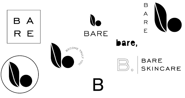
This idea was further expanded and I wanted to utilise a combination of the alphabet b together with a leaf, as the name of my brand is 'bare', and it is organic skincare brand with its ingredients mainly handpicked from the earth, or nature. I did not want to spend too much time on the sketch pad and wanted to expire my options further digitally as I can easily duplicate versions and make minor adjustments in which I previously couldn't. Below is my process of expanding and refining my logo mark.

Add caption

Add caption

Add caption
The Bare logo features a the lowercase alphabet b with the stem forming the shape of the leaf and a circle. The leaf symbolizes how all of Bare’s products come directly from the earth and is completely natural. The circle forms a huge part of Bare’s identity as it symbolizes the basic of all shapes reflecting Bare’s statement of discovering who we truly are. The circle has no design elements on it, reflecting the name Bare, which is nothing.
Below is more explorations one the brand mark positioning and typeface.
Add caption
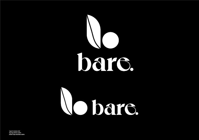
I finally settled on this type called Voyage Bold, with the name being placed below. In the name, I wanted there to be a full stop, indicating that there is nothing more or additional to Bare. Its essentially all that we need to be complete.

Add caption
Below, I am attempting to pin a color to my brand mark. Wanting it to reflect the earth and nature I had a selection of earthly tones such as brown, and greens as well. Here are some explorations of the color, before I finally set on a dark, muted green as the color for my brand mark.

I also decided on the strapline of "Become Truly You" once again feeding unto the primary belief, that by treating your skin as is, you become completely you, without having to hide behind additional make up using it as a cover rather than an enhancer. Below is the final logo with its strapline and color:

Below are the Final Deliverables: (JPEG)


Final Deliverables: (PDF)
Final Logo Animation:

 |
| Add caption |
 |
| Add caption |
 |
| Add caption |
 |
| Add caption |
Below is the progression of my ideas :
Here are few bits from the pdf above that were further used to expand and derive the final logo.
 |
| Add caption |
 |
| Add caption |
 |
| Add caption |
 |
| Add caption |
 |
| Add caption |
Below is more explorations one the brand mark positioning and typeface.
I finally settled on this type called Voyage Bold, with the name being placed below. In the name, I wanted there to be a full stop, indicating that there is nothing more or additional to Bare. Its essentially all that we need to be complete. |
| Add caption |
 |
| Add caption |
Below, I am attempting to pin a color to my brand mark. Wanting it to reflect the earth and nature I had a selection of earthly tones such as brown, and greens as well. Here are some explorations of the color, before I finally set on a dark, muted green as the color for my brand mark.

I also decided on the strapline of "Become Truly You" once again feeding unto the primary belief, that by treating your skin as is, you become completely you, without having to hide behind additional make up using it as a cover rather than an enhancer. Below is the final logo with its strapline and color:

Below are the Final Deliverables: (JPEG)


Final Deliverables: (PDF)
Final Logo Animation:
FEEDBACK
Week 5
Specific Feedback
1. The name sounds good, it reflects the values and vision in the brand profile.2. Keep exploring, my logo ideas are not strong enough. Though the idea is there, the sketches are not there yet. I have the right idea, but Im not able to discover the right mark.General Feedback
1. Keep asking yourself what are you learning.
2. Always have the mindset that it is a real client's job.
Week 6Specific Feedback: 1. Since I am designing my logo in a very graphical format, I have to emulate that style completely. The challenge for me that a graphical logo is very refined, and since mine is an organic brand the line on my leaf, it should be straight, but with a slight curvature, to give the organic feel. 2. Keep exploring. keep exhausting all your choices.
General Feedback: 1. We have to work really fast as it all has to be completed with the 9 deliverables by Week 9.
Week 7
General Feedback: no feedback as my laptop was brokenSpecific Feedback: no feedback as my laptop was broken
Week 8
General Feedback: no class (independent learning week).Specific Feedback: no class (independent learning week).
Week 6
Specific Feedback:
1. Since I am designing my logo in a very graphical format, I have to emulate that style completely. The challenge for me that a graphical logo is very refined, and since mine is an organic brand the line on my leaf, it should be straight, but with a slight curvature, to give the organic feel.
2. Keep exploring. keep exhausting all your choices.
General Feedback:
1. We have to work really fast as it all has to be completed with the 9 deliverables by Week 9.
Week 7
General Feedback: no feedback as my laptop was broken
Specific Feedback: no feedback as my laptop was broken
Week 8
General Feedback: no class (independent learning week).
Specific Feedback: no class (independent learning week).
REFLECTION
ExperiencesThe experience through this Project is extremely gruelling. I am really questioning my abilities, but I think, I will be able to pull it through. I know that I have this vision on how I want the brand to be, but I have to pay more attention to the concept rather than just the aesthetics. There has to be a meaning, a purpose to everything that I am doing.
ObservationIm beginning to notice that I am feeling a little burned out. I am unable to find the motivation to keep going. I feel like everything I am doing is wrong. What I feel is right, is now wrong. I am not sure if I am just referring to the wrong brands as my reference, or what in the world is going on, but I need to begin to identify good design from poor design.
FindingsIt is extremely important to have meaning and a purpose behind each and every decision that we're making. Though at times its alright to follow the gut, more often than not, it is always best to have a rational behind the decision. A sound thought process as the client does not care tabout the look or aesthetic. They wanna know WHY? Why did you do that? Why did you take the decision. So, we've always got to have a sound reason behind everything that we do.
FURTHER READING
The book that I read is The Brand Gap by Marty Neumeier. Below are just some of the pages from the book and my understanding / interpretation of it:

As people have time again repeated Marty Neumeier's words on what a brand is, it is essentially how the masses or the society perceives and 'feels' about your service or product. Though much importance is placed one its visual identity, it is what the visual identity creates amongst the people how they feel. Branding goes beyond the visual identity such as the logo, colors etc but also about the brands value, messaging and people who are emotional beings, more often than not ruled by instinct will be able to sense what you stand for as a brand through your branding.

So, here Marty Neumeier, states that the main purpose if branding is to get more people to buy more stuff for more years at a higher price. Meaning, your branding should be able to create a loyalty amongst your customers. I also feel that when designing the brand overview and identity this should be kept in mind. The purpose of branding isn't to look good, but that particular design has to be able resonate with the audience, customers and persuade them to buy your product or service. Thus, it is important to have a good understanding and resonate at the same understanding of the brands ideal client and audience before designing a brand. Bridging the logical aspect of brand strategy with the emotional aspect of brand identity design forms a wholesome quality brand that will resonate with its customers. Below are one of the 5 principles of brand building which is To Differentiate

Here, Marty states that we are always seeking to notice what is different. I understood that anything that blends in with the crowd will ultimately suffocate as the market is too saturated. Just like the image above, at one glance, we skim past everything and the eye lands on the black circle. Our attention will always fall on something that is different be it a good different or a bad different. (haha)

Marty then explains that to achieve a level of differentiation, clarity and focus is imperative. Unless we have compelling and solid answers to the questions above, we need more focus. Marty says that most common reason for loss of focus is poor brand extensions. Marty further explains this by giving an example of a focussed and unfocused brand.
FOCUSED PORSCHE = SPORTS CARS
UNFOCUSED PORSCHE = SPORTS CARS + SUV
I understood this statement as failing to niche down. By finding that niche market, we are able to pose ourselves as an expert in a field automatically becoming a premium brand rather than something that does everything without much clarity.


UNFOCUSED
PORSCHE = SPORTS CARS + SUV


Comments
Post a Comment